


3 Simple Things You Can Do Today to Improve Your Conversion Rate

Feel like your website isn’t working like it should?
There are some pretty easy to impliment steps that you can take today to improve your websites conversion rate (aka, the % of website visitors that click through and purchase or book your product/service).
If people are visiting but not inquiring, booking, or buying, the issue likely isn’t visibility. It’s conversion.
Conversion rate is simply the percentage of people who take the action you want them to take , whether that’s filling out a form, scheduling a call, or downloading a resource.
And when your website or sales page isn’t converting? It can feel frustrating, confusing, and frankly… like all your effort is going to waste.
The good news? You don’t need a full redesign or complicated funnel to see improvements.
Today we’re walking through three quick, strategic updates you can make right now, to improve your conversion rate and turn more visitors into actual clients.
PS. These three easy tweaks can be done in less than an hour!

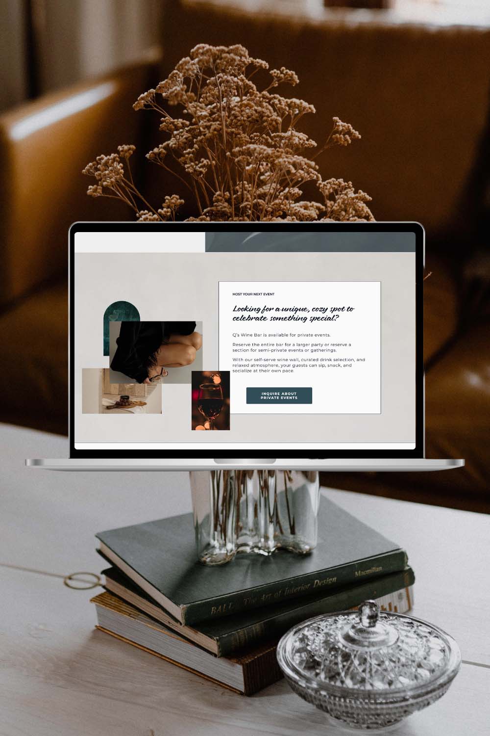
STEP 1: Simplify Your Call-to-Action
Listen… I’m not saying you should call your audience dumb, but it should be SO easy to find and understand your CTA (Call To Action) that a 3rd grader can understand it.
The magic formula for a good CTA is 1 part UX (User Experience) and 1 part Copywiritng.
User Experience
AKA: Is it easy to see, easy to find, and easy to click.
The first thing you should consider is where is it at? Is your CTA button in a place where users will expect it to be? Does it have contrast to the background? Is the button big enough for your grandpa to click on?
Users expect to find CTAs in the hero section (the very top section of the page) and in the upper right-hand corner of the menu.
Your most important CTAs should be placed there, like your inquiry page, a button to call, or an add to cart button.
It’s also important that your CTA stands out from the background and doesn’t blend in with the rest of the page. Using a brighter color will instantly catch your viewers eye and sends a no-brainer “look at me!” message to the viewer.
Your buttons should also be an appropriate size. There are exceptions to this rule but generally your button should have enough space to fit the text, and leave enough padding (empty space around the text) to fit an uppercase W all around your text.
Copywriting
Your CTA shouldn’t be too generic OR too confusing.
Whenever possible avoid using “Learn More” or “Buy Now” (don’t feel too bad we have to use these all the time!) Ask yourself if there is a more compelling way to say these without making the CTA too confusing.
Instead of “Learn More” you could use:
- Read The Story
- See How It Works
- Watch Our Proven Method
- This Is How We Did It
- This Client Got 3x Results
- How We Went From X To Y
- What Makes This Different
- Click To See The Results
Instead of “Buy Now” or “Book Now” you could use:
- Get Yours Today
- Get These Results
- [Insert Result] Now
- I’m Ready To Stop Wasting [Time/Money]
- Save Your Spot
- Ready For Something That WORKS?
- Start Getting Results Today
- I Need This
- Join The [Brand or Results] Club
- Get Instant Access
At the same time, make sure you’re not trying TOO hard to make your CTA unique. If a 3rd grader couldn’t understand what’s going to happen when they click the button then its too complicated and you need to simplify.
STEP 2: Tighten Your Website Messaging
As much as it pains me to say it… copywriting is MORE important than design.
The copywriting (or text) on your website will have a huge impact on the way your website converts. That’s not to say that the design isn’t incredibly important, but a stunning website with sh*t copy won’t convert as well as a basic website with killer copy.
It’s one of the reasons that we include full website copywriting for all of our web design clients.
Going back to the point I made in the CTA section, it should be SO easy to understand that a 3rd grader could get it.
There seems to be two routes that business owners take when writing their own copy.
They overshare, overcomplicate, and overwhelm.
Or…
They don’t know what to say, so they say nothing.
If you’re in camp 1 (ovesharing and overcomplicating) You probably feel like you need to say alot and justify alot of what you’re doing to qualify yourself in the eyes of your customers/clients. Hello imposter syndrome.
In reality, this doesn’t make you look more qualified it makes your website look like a fancy resume. Talk less about yourself and what you do and make it 100% about the client.
Basically stop talking about yourself and why you’re so great.

Your entire website should be about serving the viewer. How can you help them, why do they need your help, what should they expect, etc.
If you’re in camp 2, where you’re so overwhelmed about what you should say that you take minimalism to a whole new level and skip the copy as much as possible, then you’re also being selfish.
Keep it simple, but you should still be walking viewers through how they can, who should ,and why they should, work with you.
Again, focus on the clients pain points, show the results that you can provide them, and make it easy to understand what it’s like working with you.
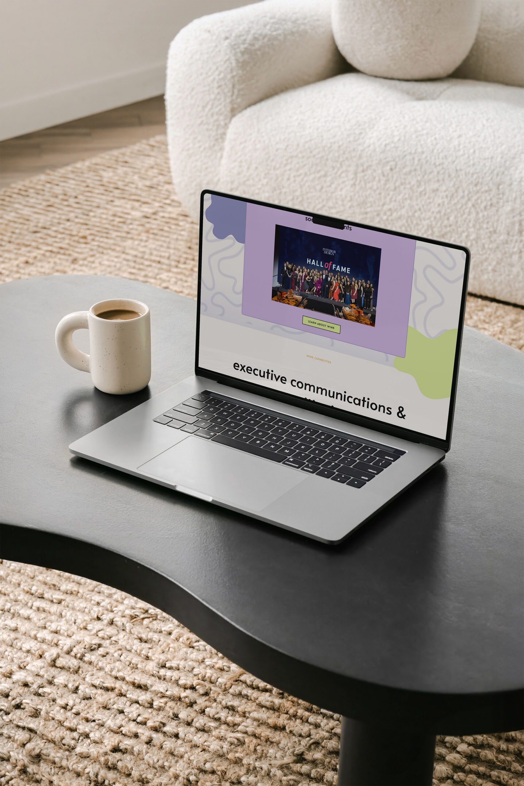
STEP 3: Use Social Proof Strategically
One of the fastest ways to increase conversions is by showing people that others have already trusted you, and gotten results. That’s what social proof is: evidence that your work is valued, appreciated, and worth investing in.
It builds trust quickly, answers silent objections, and helps potential clients feel more confident saying “yes.”
Here are a few simple ways to add social proof to your site:
- Client Testimonials
Short, specific quotes from happy clients go a long way. Place them near your services, calls-to-action, or on your homepage. - Logos of Brands or Clients You’ve Worked With
Even if you only have a few, a row of logos creates instant credibility. - Before & After Results or Case Studies
Share mini case studies or transformations that show the impact of your work. - Social Stats
If you have a strong following, lots of downloads, or positive feedback from content, that counts as proof too.
What If You Don’t Have Social Proof Yet?
No problem, everyone starts somewhere. Here’s how you can build credibility without a long client list:
- Gather Informal Feedback
Ask peers, beta clients, or collaborators for honest reviews. Even one thoughtful testimonial is better than none. - Highlight Your Expertise
Share content (like blog posts, free resources, or trainings) that shows your knowledge and gives your audience a quick win. - Show the Process
Walk people through what it’s like to work with you. A transparent process builds trust, even if you’re newer to business. - Use Confidence-Boosting Copy
Be clear about who your service is for, how it helps, and why you’re the right person to offer it. Clear positioning helps clients feel like they’ve found the right fit, even without a ton of proof. - Use Industry Standard Statistics
Even if you don’t have a ton of client stats to provide, you can still highligh how important your service is through the use of industry standard stats. Be conservative (under-promise, over-deliver!) and use those stats to boost the importance of what you do.
The bottom line? You don’t need dozens of glowing reviews to build trust. A few intentional pieces of social proof or strong, strategic messaging can go a long way.
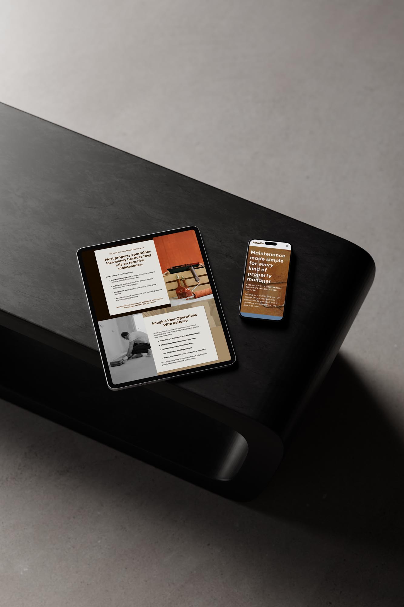
BONUS STEP: Review Your Website on Mobile
You could have the best copy, beautiful visuals, and a strong call-to-action, but if your website isn’t mobile-friendly, you’re losing potential clients before they even read the first line.
Mobile-first design isn’t optional anymore. It’s essential.
- Over 60% of all web traffic now comes from mobile devices
- 63% of consumers prefer to find information about brands and products with their mobile devices
- 61% of users have a higher opinion of mobile-friendly websites than they do of non-mobile-friendly ones
(Source)
If your site isn’t performing well on mobile, you could be missing out on more than half of your audience.
Here’s what to check:
- Is your CTA button clearly visible and easy to tap?
Avoid burying your button at the bottom or making it too small to click comfortably. - Is your text legible without pinching or zooming?
Small fonts and tight spacing create friction — and friction kills conversions. - Are your layouts and images stacking properly?
Elements that look polished on desktop often get jumbled on a phone. Test every key page. - Do forms function correctly?
Broken inquiry forms or clunky opt-ins = lost leads. - Does your site load fast on mobile data?
Even a few seconds of delay can drive users away — Google reports that 53% of mobile visitors leave if a page takes more than 3 seconds to load.
Key Takeaways
Working on your CTAs, improving your copywriting, and adding social proof are 3 easy ways to improve your conversion rate and can be implimented pretty quickly!
Sometimes, it’s about small, strategic shifts: simplifying your call-to-action, tightening your message, adding the right kind of proof, and making sure your site actually works where it matters most: on mobile.
These changes can help your site do what it was meant to do, connect with the right people and convert them into clients.
But if you’re feeling stuck, second-guessing every design choice, or simply don’t have time to figure it all out on your own, you don’t have to.
We design custom Showit websites for service providers who are ready to uplevel their brand, their client experience, and their results.
Whether you’re ready to start fresh with a strategic, conversion-focused site or want a designer who can finally bring your vision to life, we’re here for it!
Let’s make your website your hardest-working team member.
Book a discovery call or explore our website design services to get started.
Recent Posts on the Blog

Is your brand actually doing anything?
Test your brand
Take the brand assessment quiz to find out.


